Avocash – Financial Literacy App
Project info
Duration: 5 days ( gosh! )
Client*: Avocash – *Special thanks to Avocademy for this designathon challenge.
Team: Ben Walton & Jennifer Bishop
Roles: UX designers, researchers, UI & high-fidelity designers
Tools: Figma

Avocademy announced their first-ever designathon in 2022, Ben and I decided to collaborate on a case study. We had less than a week to complete this design challenge but had a blast exploring the possibilities together!
Problem Statement
“How might we explore how to improve financial literacy?”
Overview
Avocash helps users with the on-going challenges of understanding finances in easily digestible, bite-sized lessons. Users can connect all of their financial accounts into one app for a high-level view into financial health with an added incentive of offering real-world rewards tied into what they’ve learned through the lesson curriculum.

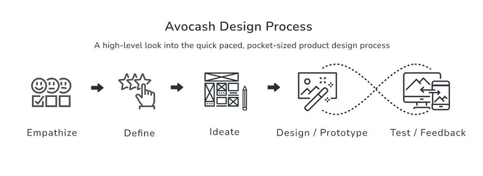
Design Process
Empathize: Surveying the User Base
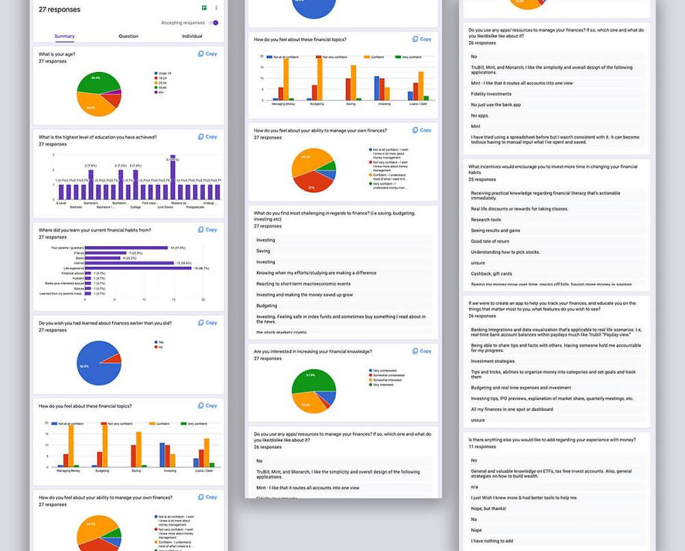
To understand the users needs and challenges… we published a survey geared towards topics, issues and general knowledge within the realm of financial literacy. Our 27 responses helped us gain statistical significance surrounding the various pain points, and challenges our users had, and we began to formulate how we could solve for those problems.

User Persona
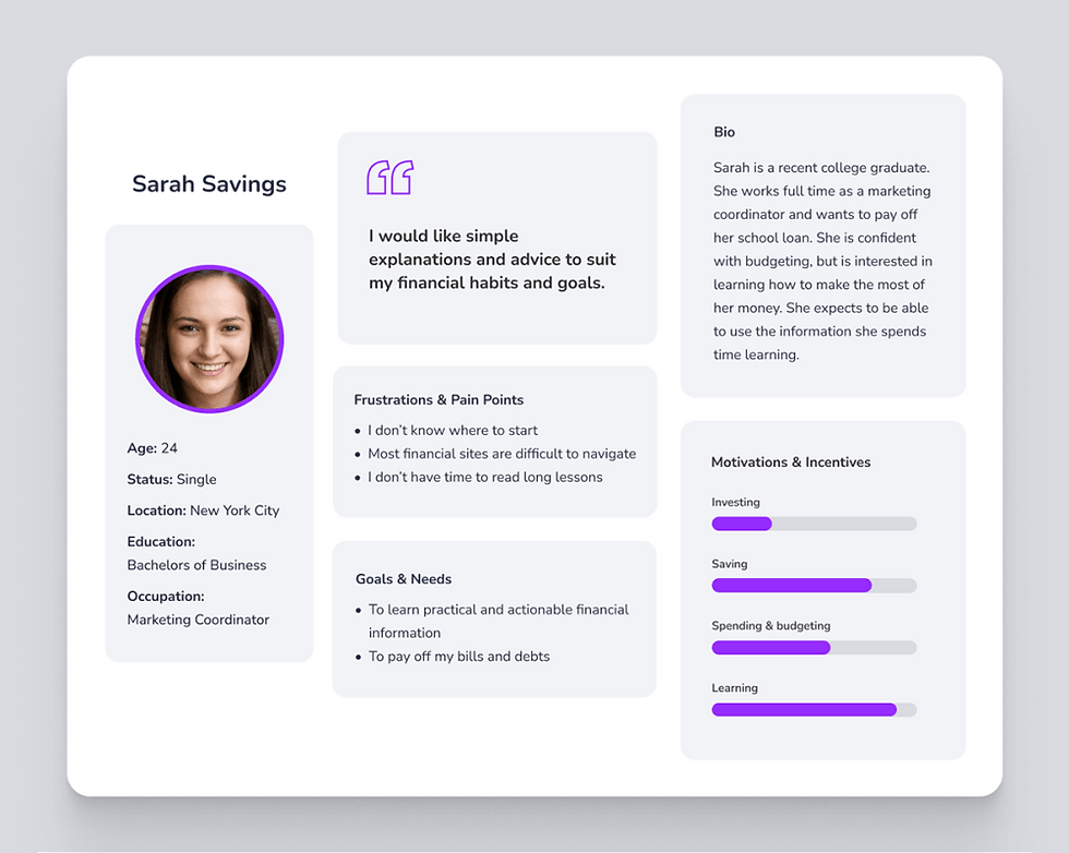
After analyzing the data from the survey, we were ready to craft a user persona to see how we could tailor our design to solve for pain points. Meet Sarah Savings!
Competitive Analysis
Oh did we dig in on the competitor analysis! Being that Ben is from the UK, and I am from the USA – we had our pick of the crop on both sides of the pond to analyze! Phew…
Initial notes everywhere…

Project Goals
After gaining some clarity into user needs and how existing apps had flaws and pain points to address, we created our pocket-sized list of project goals. Finally!
Build a robust app which would allow users to connect their accounts, track spendings, and savings and earn rewards for completing financial courses.
Create a clear, searchable library of bite-sized lessons and videos curated to the users interests.
Ideating & Task Flows
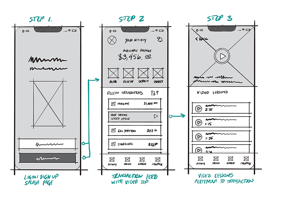
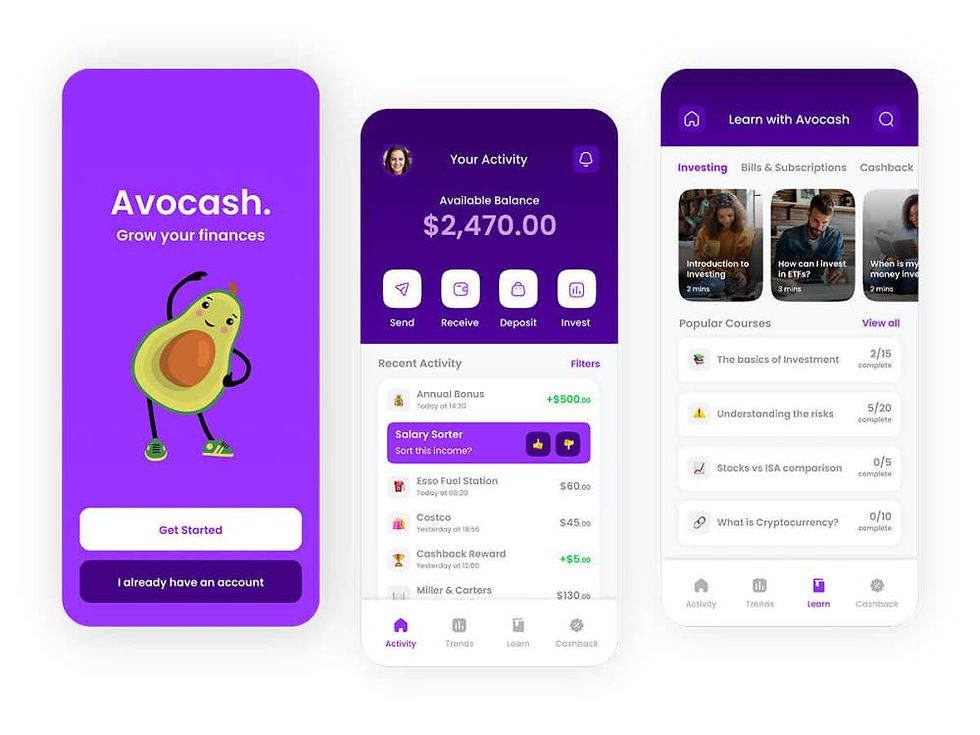
We created a high-level flow for the specific task of seeing tips / notifications in the users transaction feed, and asking if they would like to take a lesson on how to invest a new bonus that was received.

Sketches
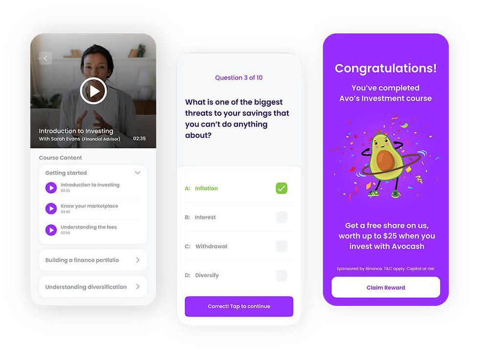
We focused on the screens needed to convey the flow of viewing a tip/notification in the recent transaction feed, and then viewing a financial literacy lesson related to the transaction.
Designing the UI / Mini Style Guide
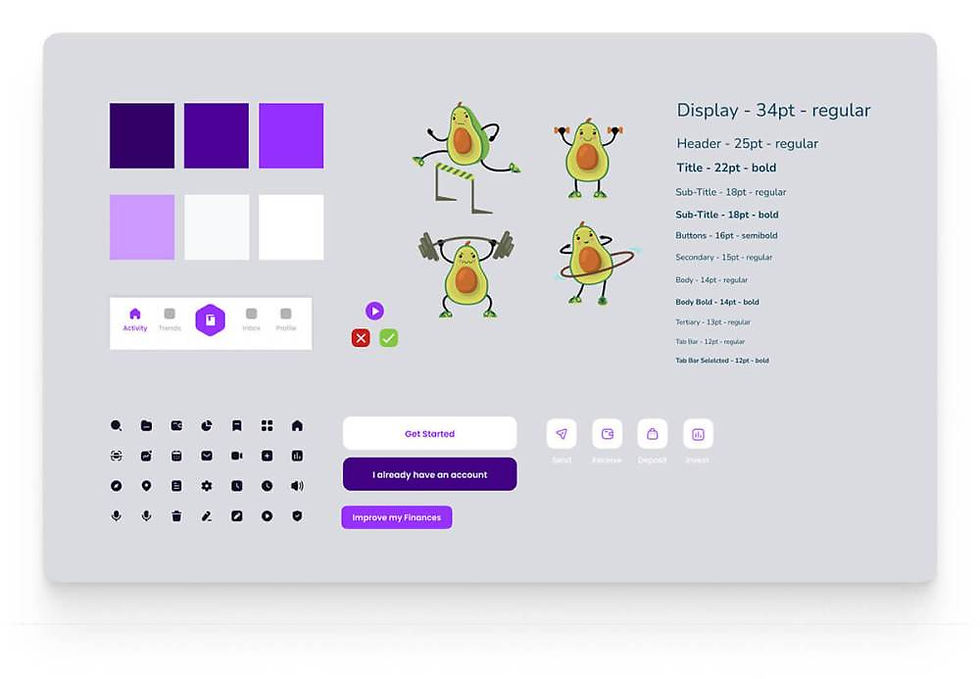
To give the design a fun and playful look/feel, we chose to use avocado illustrations as our mascot, (hat tip to Avocademy!) and staying within the complementary color realm of purples – evocative of richness, wisdom and energy. 💜 *illustrations courtesy of Freepix
Hi-fi screens
The following screens were built in Figma for iOS language.

Testing / Feedback & Lessons Learned
Due to the quick turnaround of this challenge, we were not able to do ample testing for feedback, but we are looking forward to carrying this design out further and exploring how we can best iterate for a better user experience.
Overall, the designathon was an eye-opening for us both. It came with its own set of challenges which set us out on the hunt for more information. We will revisit this project in the future to gather more feedback, build out more screens and further our research.