Pocket UX case study: Pumpkin carving app
- architette
- Oct 27, 2023
- 4 min read
Updated: Oct 29, 2023
Greetings and welcome to a spine-tingling installment of Pocket UX - Halloween edition! 🎃 👻 🦇 These mini UX/UI app designs are my favorite potion for honing my skills and adding a touch of magic to my craft!
Project Info
Duration: 2 weeks +/-
Concept client: Carve It
Role: UX / UI Designer
Mediums: Figma, Procreate

Problem Statement
“How can we better understand the needs and goals of users who are looking to carve a pumpkin for Halloween?”
Overview
Carve it is a mobile app for those who want to carve a pumpkin but don't know what design to carve, where to buy the tools they need, or need advice on how to preserve their pumpkin after carving.
Design Process
Before conjuring up screens, research is my cauldron's brew. 👻 Even with the quick, self-imposed turnaround for this UX/UI challenge, following the same overall process structure maximizes my time and effort.
Empathize
Define
Ideate
Design / Prototype
Test / Feedback
1. Empathize
Competitive Analysis
Even if Halloween is filled with trick-or-treating and costumes... we still need to pay attention to the competition. 😉 Recognizing the significance of mobile devices in the lives of many, I decided to focus on mobile apps dedicated to pumpkin carving, both in the physical and virtual worlds.

*It is worth noting: the last app analyzed was virtual pumpkin carving only.
In the app marketplace, I discovered a diverse array of options. However, it was clear only a select few truly excelled to a point where they warranted in-depth analysis. Even within this handful, it became evident that there remained ample room for improvement, highlighting the ever-present potential for enhancing the user experience.
User Research and Pain Points
First, I analyzed reviews for these apps, then read through reviews on websites, and social media posts about pumpkin carving. This gave me a good foundation to identify "must-have" features. I also posted a multiple choice question and an open answer field on my Instagram stories for quantitative and qualitative feedback surrounding pumpkin carving pain points. Lastly, I also took a peek at some top google searches which came up for pumpkin carving.

2. Define
Project Goals
After gaining some clarity into user needs and how existing solutions had some missed opportunities, I gathered my research and created a pocket-sized list of project goals.
I wanted to:
🎃 Help users find designs they want to carve into their pumpkins
🎃 Guide users to where they can buy pumpkin carving tools
🎃 Give users access to tutorials, tips and tricks on how to preserve their pumpkins
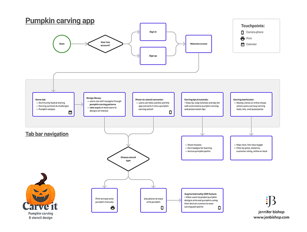
Task Flow
Given the quick-paced nature of this challenge, I chose to create a high-level flow for various features in the app. I also used icons to represent user touch points which would most likely occur outside/beyond the app.

3. Ideate
Sketches / Wireframing

I just LOVE sketching in Procreate on my iPad for screen designs. The ability to draw on multiple layers, fill in blocks of grey, and import supporting graphics are just to name a few reasons! They absolutely become the blueprint for the final UI.
I broke down my sketches into mini, high-level steps to support the project goals:
🎃 Help users find designs they want to carve into their pumpkins
Design library --> individual pumpkin design
Virtual stencil projection and tools via the users camera
Design style quiz

🎃 Guide users to where they can buy pumpkin carving tools
Using maps to search for pumpkin carving tools locally and/or online
🎃 Give users access to tutorials, tips and tricks on how to preserve their pumpkins
Video tutorial library --> individual course

And then I sprinkled in these screens for context
Sign in / sign up
Splash screen
Home Screen

4. Design / Prototype
UI Kit / Mini Style Guide
Hold onto your broomsticks because this is my first design in dark mode! 🖤 Not only does dark mode serve as an enchanting canvas for the vibrant pumpkin designs to take center stage, but it's also has that eerie Halloween vibe! 🎃

Logo design: cycles through various faces to support the idea of the app helping one find their design
Typography: simple with only two styles: Rakkas for display and Signika Negative for everything else
Iconography: outlined style to support the idea that this app is for tracing, designing and carving a pumpkin up!
Color palette: leans heavily to shades of purple, as it is a natural complementary color to pumpkin orange which will be predominantly present throughout the pp
Hi-fi screens
The following screens were built in Figma for iOS language.


5. Test / Feedback
I posted this project online for feedback surrounding the UI, and am in the middle of usability testing with a small group of volunteer users. Excited to see what insights we find!
Results & Lessons Learned
This pocket-sized product design exercise came with its own set of challenges (mainly time!). I’d like to explore the AR feature a little more to understand how one could place a virtual stencil on a rounded surface - if it is even possible!
I'd also like to explore if there is a developer out there who'd maybe take this app on as a collaboration app to launch, since there's nothing else like it out there as of now.
In any case, this hauntingly fun adventure has been a real scream, and I bid you adieu until our next spine-chilling rendezvous. Until then, may the spirits of design guide you! 👻🕸️🎃
Disclaimer: The thoughts shared in this blog are solely my own and do not represent the perspectives of my professional relationships or clientele.


Comments